Thursday 13 November 2014

Bits and Bobs

There were a few things I meant to upload a while ago but never got round to, so it’s about time they were put up.

What I want to discuss is the programming of the game itself and how the game is now looking rather fetching indeed. (For a bit of background info have a quick read of my previous programming post)

Now fortunately for me, and for anyone downloading the game, I have managed to figure out a lot of the code and what it all means. It’s actually surprisingly simple once you work it out! So that means I've been able to customise my other menus plus I've made various other tweaks. The Tailor menu currently looks like this:

Tailor Menu for Hadron Gateway

Which, like the main menu, is an imagemap so the code then looks like:


Tailor Menu Code


The load and save screen are identical imagemaps so I'll show only one:

Save/Load Menu for Hadron Gateway


It has 6 pages each with 6 slots which works out at 12 per story. That might be more than enough for those who like to save over their last save point, however, for those who create dozens of saves in one sitting, you'll have to discipline yourselves! Presenting the Code for the save screen:

Save/Load Menu Code

Next is an example of one of the several confirmation screens. It does what it says on the box really...


Confirmation Screen for Hadron Gateway

It was extremely easy to code and consisted of only a few lines and no setbacks (very rare)


Confirmation Code

As you can see, each menu fits the same circular composition keeping the whole thing pleasingly consistent and entirely different from the default settings. Everything is looking great but the only problem is that the game file now contains so many images that it’s taking up more space than I'm comfortable with. To control the file size I shrank the dimensions of the game overall and will have to plan the illustrations very carefully but even then it’s going to be pretty huge. 
Its slighly frustrating that despite working out how to put the game together without using imagemaps I'm still stuck because of the filter -  It covers the whole picture to give each menu its colour so I can’t use anything other than an imagemap... so leave the problem with me and I'll figure something out! At least I learned something anyway.

I have also added transitions between menus to stop it feeling so abrupt when the buttons are clicked and I've dropped in a couple of splash screens to introduce each story. I won’t be spoiling you with those though. Since this post contains more than enough pretty pictures, I'll leave it at that and show you more of the fun stuff next time!

Thursday 6 November 2014

The Belt

I have more updates! (Not the ones I intended, but in my defence I got distracted having fun with the art).
I've moved on to the story settings to get a feel for the environments the characters are going to be in. The following image is the concept for the Belt - D'rosk's world.


The Belt for Hadron Gateway

The Belt was earned its nickname for being somewhat like a conveyer belt system - raw materials from the Empire in one end and Atomwave warheads out of the other. It’s a cold and over populated environment so I tried to capture that with the cool colours. I haven't ever tried illustrating city scenes before so it's not something I feel comfortable with and since most of the story will be in built up areas I figured it was time to fix that. For the first go, I have to say I'm very pleased at how it turned out and I'm taking it as a good sign for the rest of the settings. I want each world's capital to be distinctly different so D’rosk’s is the only one that will be a frozen environment. Though it’s on the some latitude as all other Gate capitals, the Belt's natural environment was destroyed by pollution leading to total devastation and a rapid change in temperature known infamously as The Frost.

So what do you think of the Belt?

Thursday 16 October 2014

Where to Begin...

As usual I've gotten so absorbed by the project that I've not posted in a long time. At least you know that a long pause means I'm busy making progress - it’s if I post regularly that you should start worrying!

The result of such a long gap means I've got so much to post that I won’t be putting it all into this one, so don’t worry if it seems like less than you were expecting.

To start off with, I've managed to plough my way through about 1/5th of D'rosk's story and it’s looking not bad so far. There are a few scenes that need changed to include important information, better character development and fewer words but overall the picture is taking shape. Poor D'rosk has already had a fair share of action and close shaves and the pace is about to race ahead as his life get out of control. I think the peripheral characters all need work especially one particular who I want to put a lot more focus on because she’s too good to leave out.
Her name is Zohari and she’s going to be D'rosk's biggest challenge because shes both physically and intellectually sharp with a huge amount of armed and political power behind her. Assassinating her is going to prove so much harder than D'rosk first thought.

Zohari

Zohari for Hadron Gateway

Her design is meant to reflect her toughness so I went for a build that makes her look as if she could snap D'rosk like a twig whilst still looking feminine and not comically huge. She's from a very hot climate (hence the shorts) and her colour scheme was meant to reflect that warmth. I haven’t completed her in full shadow and soft shading because I only really need her as a guide for when I come to illustrate the full project, so I'll not be uploading a finished piece.
What do you think of Zohari?

Next on the list is the doodles I've been doing the past few days. Now that I have designed a large portion of the characters, my next challenge is making sure I can draw them accurately from every angle, in every expression and that can only be done with time and practice until it becomes natural. I think I've managed to pin down the majority and instinctively made little tweaks to them. Some of the sketches are very loose and aren’t entirely accurate.


Doodle 1 from left to right: 1. Jen showing the amateurs who’s boss (Yes, I need to brush up on weapon designs). 2. D'rosk discussing a serious problem. 3. Laythan very upset. 4. Ravvi (D'rosk's bodyguard), looking mischievous.

Doodle 1 for Hadron Gateway
 
Doodle 2: Avio winding Rheeven up while Rheeven is having none of it. Proportionally, Rheeven’s legs are tiny but otherwise they're looking good.

Doodle 2 for Hadron Gateway

Doodle 3: Denji scarpering after no doubt wreaking havoc. I can imagine the sounds of intruder alarms going off behind him.

Doodle 3 for Hadron Gateway

 Doodle 4 from left to right, top to bottom: 1. Stubborn Laythan, exactly as he'd look with a gun to his head. 2. Cruel Code-Spawn. 3. Uneasy Rheeven (his eyes are a little far up his face and his hairline isn't quite right). 4. D'rosk mid-spiel looking none too impressed. 5. Nile looking ever ready to take on the world. 6. Filo as happy as ever. 7. Zohari presenting a pleasant appearance, letting nothing on.

Doodle 4 for Hadron Gateway
 
Doodle 5 from left to right top to bottom: 1. Myatt unimpressed with Laythan, Jen's and Denji's misadventures. 2. Rheeven in immediate peril. 3. D'rosk treating Ravvi to a well deserved scowl. 4. Faolon spotting something amiss. 5. Caelin looking as innocent as ever. 6. Faolon smiling down on Rheeven. 7. Laythan upon running into a room full of whiptail hounds. 8. Rheeven having to repeat himself for the thousandth time. 9. Nile watching Rheeven, Filo and Avio mess arround.

Doodle 5 for Hadron Gateway

Doodle 6 from left to right: 1. Filo winding up Rheeven. 2. Myatt angry 3. Leeya unimpressed

Doodle 6 for Hadron Gateway

Doodle 7: 1. Lonyo discussing something serious. 2. Laythan spotting something that will lead to mischief. 3. Nile and Rheeven ducked behind a wall.

Doodle 7 for Hadron Gateway

 Doodle 8: Rheeven (without his glasses) looking up at Avio

Doodle 8 for Hadron Gateway
  
Now that I've done these I've realised that the expression sheets that I made for Laythan and Rheeven (the ones that go in beside the textbox like this) are relatively quite weak despite being accurately drawn. I could easily push them further but redoing them will take up more time so I'm currently undecided.
At least I can say for certain that I'm drawing them more accurately with increasing ease which will lend a big hand when I come to illustrate the full game.
Your thoughts on the doodles?

I will update again soon with more of the stuff you've missed out on!

Monday 28 July 2014

Something nice to look at

Hello! Just another overdue update on the progress that’s been made over the summer. Due to outside circumstance I haven’t managed to get through as much as I would have liked to, however things are still moving forward and developing well. The sequence of events in D’rosk’s story are almost finalised, I just need to work out the timing of the scenes so that they match in with Laythan's and Rheeven's stories. I could do with visualising the action scenes in a little more detail but that will come naturally as I listen to good music. So far his story has been inspired by some of the great songs in this inspiring music compilation - Action and Adventure Music. So you can already tell the sort of grand scale the action is going to be on.

I have mostly been doing artwork while I've not had a story to write and there are some more characters I can show off.

Kalare


Kalare for Hadron Gateway

This is Laythan’s mum Kalare. Though she doesn't feature much in the story, she does pop up in one of Laythan's few remaining memories so I worked hard on getting her right rather than defaulting to a generic mother figure. Seeing as she was a young single mother who had to keep her little son alive while travelling in a rough environment I had to make her look tough instead of homely She still has a kind face because I wanted to make it clear that Laythan had a tough but very loving mum. She has a short stature and although Laythan doesn’t really take any of her facial features, he still has her dark brown hair and bright green eye colour.
So what do you think of her?

Next is a long awaited example of the illustration style plus what it will look like on screen with the textbox.


Illustration Style Example for Hadron Gateway

The line work is going to be black and I intend on making it quite thick. The colour is going to be applied with plenty of texture rather than going for dull flat colour with cell shading.
What do you think of it? Is it vibrant enough?

Friday 23 May 2014

The Text Box and Other News

Things are coming along nicely as always! And I have a few things to show today.
Firstly is the text box which I designed a while back:


As you can see I have also begun compiling the character expressions. Rheeven's stock is complete and Laythan's is well on its way. Here are a few examples from Rheeven's stock:


I have been cutting down the word count in Rheeven’s story and will continue to relentlessly shave it down until only the relevant parts remain. It’s not an easy task because it’s very difficult to read my own writing objectively but I will make sure I'm being as relevant and concise as possible!

Tuesday 29 April 2014

Fresh updates!

Well it’s been over a month since I finished Rheeven's script (not counting three endings which can’t be written until I'm sure of D'rosk's). I've been spending the time pondering over D'rosk's story and it’s all piecing together quite nicely. I had hoped to have it all in place by the time I'd finished Rheeven's but unfortunately its a process that I cant hurry; it happens in its own time and I just have to deal with it. 
The result of this break from writing is that I've been doing artwork and character design whilst listening to inspirational music. And at some point along the way I designed Laythan’s mum. She's Asian which means Laythan has been given a change in skin colour and he's looking much better for it if I'm honest. The colour scheme works very nicely.

Laythan for Hadron Gateway


So what do you think?
I'll need to do an update on all images containing him but I think its well worth it.

Sunday 16 March 2014

The Joys of Code..

As I'm sure you’ve guessed, this one is all about the progress I’ve made in actually putting the game together. I'd like to start by saying that I have absolutely no programming knowledge so I might as well be trying to build a game in Swahili for all the sense it makes to me. But I have to say that despite having no programming knowledge, I’ve done a pretty good job setting up so far. It hasn’t been without its difficulties though.

Luckily for me I'm using Ren'py which tells me when I have a problem and what the nature of the problem is like so:


This one is fairly self explanatory because it tells me that "colour" is an unknown property (Ren'py goes by American English so its looking for "color"). It’s telling me that I've tried to use a property that doesn’t exist. So it can be very handy when it’s simple and specific. But when it starts giving me unspecific code gibberish back then I start to loose my patience. Even things that would be simple to a programmer, like "X is not a valid child of Y" etc, I find it very difficult because I have no basic knowledge of the correct names and terms nor how to work them properly. This makes solving problems almost impossible for me. So baring that in mind, have a look at the progress I’ve made.

When opening the default game, it looked like this:


Perfectly usable but hardly personalised. Obviously I want this page to scream Hadron Gateway so I set about designing the look I needed for it and came up with this:


As you can see, I went for a wide screen look to give more space for the game content. That and its 2014... who’s not using widescreen? The big difference is that instead of a "Start Game" button I have split the image into three clickable areas, each representing a character and story. I thought this might be more interesting and practical than simply leaving a "Start Game" button at the side with an illustration as mere decoration. Plus it made more sense given that there are three different start options (but I'll come to that later). The main menu on the right side has been spread out and taken out of its individual boxes for a bit of breathing room. I used a font called Octant that reflects the futuristic yet slightly steampunk feel of the game, so that gives it a lot more interest overall. I gave the title a gold and silver shine to jazz it up a bit.

So how does that translate in the code? It’s fairly easy to explain. This is how the default looked:


It has clearly created buttons in a set style then told the game where to put them and what to do when they are clicked. These buttons are separate from the background image and the text on the buttons is separate from the button - think of it like lots of separate layers all piled on top of each other. Unfortunately for me I have no idea how to create my own custom buttons so that made life a little awkward. The easy way around was to simply create one flat image with no buttons and no layers. All I had to do then was create hotspots.

To put it simple, a hotspot is a rectangular area with a command set to it. I place the rectangle then tell the game what I want to do when the player hovers or clicks on that area. It looks like this:


The coordinates tell the game where the rectangle is and then the action tells it what to do. The top line for example tells it to Start - a command which Ren'py understands. It doesn’t understand "begin" or "commence" etc so I have to make sure I'm telling it things it already knows how to do. I'm sure there’s probably a way to define "begin" as meaning "start" but that’s currently over my head. The part after that is just an extra bit to tell it where to start from. I've already previously told it what "laythan_script" is so it has no issues. So that’s not very complicated.

Unfortunately, using hotspots left me unable to do the fun stuff I wanted to do. You see where it says "ground 'MainMenu1Ground.jpg'"? Well that’s image number three in this post and it’s the flat file I used to put hotspots over. The image below is the hover image. Imagine it as being placed underneath the first one and whenever you hover over a hotspot, a little rectangular shape the same size as the hotspot is cut away to reveal the picture beneath. So if I made a hotspot over "Help" and made it so that the world "Help" on the image underneath was bright orange, it would look as if the help button turned orange each time you hover over it.

I wanted it too look as if each character's whole section glowed whenever 
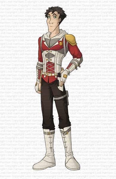
someone hovered over it. So for example, if the player hovered over Laythan it would look like this:


But what’s the problem? It’s glaringly obvious but it simply didn’t occur to me... hotspots are only rectangular... that hover area is not. There was no way of getting the whole thing to light up without catching parts of the other two. So I had to settle with just making the character names glow as the mouse gets near. I was disappointed but prepared to accept it for the sake of not wasting any more time.

So what’s the problem then? Well... the main menu might work using hotspots but all other menus don’t. I'm currently stuck on the default. The game menu for example currently looks like this:


As with the other defaults, it’s perfectly usable but totally bland. I want it tailored and in keeping with the main menu. In the end it means I'm going to have to work out how to define and use my own buttons... which would be fine if the instructions were made for novices but they’re not. So all my previous work on the main menu is for nothing!

On the upside I worked out how to make Rheeven and D'rosk's stories unlockable! I have set it so that when the reader finishes one story it unlocks the next. I did run into a little trouble though. If the reader had unlocked all of three games and went back to play first game then they would find that the third game had re-locked itself. I worked out that I had to copy and paste the entirety of all three stories under a new heading that I called Game_Complete where there are no locking rules. The reader would arrive into Game_Complete when the third story was complete. I'm thinking of adding in a reset button just in case anyone wants to get back out of Game_Complete mode and start from scratch with the locks back on.

So what do you think of all this? Does it seem strange to see it all coming together?

Monday 3 March 2014

This will be a big one...

Hello again!

Since there’s been a break I'm going to have loads to talk about and plenty to show.
I think it makes most sense to start with the news that I'm now writing one of the two final climaxes of Rheeven's story. There was originally only going to be one but you can blame Requiem for a Dream (which I've refused to let X Factor ruin) for inspiring the second. Zack Hemsey's This is our Legacy also inspired a change to the idea for the first climax and it’s now even better.
I'm sure no one will be surprised to hear that the story is way over my chosen word limit at a full 130 812 words. I've had to accept that the addition of a new climax scenario will force the word count up but I still intend on cutting a good few thousand out at least.

So with Rheeven's story now in the final quarter D'rosk's story is beginning to demand my attention. More accurately, D'rosk is. His personality is coming into much sharper focus and I'm finding myself very curious about him. I think out of all three, D'rosk will be the strongest main character but I have a feeling he's going attract both love and hate - either way, you wont forget him in a hurry.
I have an idea for the main twist of his story but the rest can go in several directions. As you know D'rosk's story will centre around his struggle to control a revolution while trying to assassinate the six people preceding him to one of the most powerful Empires in human existence. I would like to have a power struggle between D'rosk and one of the main rebels whilst another struggle emerges between him and one of his six targets. I had lots of exciting action scenes rushing through my head when listening to Requiem for a Dream but I found that the constraints of Laythan's story keep scuppering me. D'rosk has to be safe in certain places at certain times and that makes it hard to throw him out of his comfort zone or add any amount of struggle or peril.
So all this talk of D'rosk and yet I've still not unveiled him yet... perhaps it’s about time.

Palvan D'rosk

Palvan D'rosk for Hadron Gateway

The design for D'rosk was good fun because it gave me the chance to try to design a face that could look like both a villain for the first two stories and a hero for the last. I went with a tall athletic build that you might expect from an assassin and I think his proportions have worked out quite nicely.
I did come across a problem with his clothes however. D'rosk is the Head of State and his clothes should reflect some aspect of that, but he's not the type to wear finery - it’s far too impractical for such a practical person. And, since he’s not interested in showing off and looking rich, I couldn't go for anything too fancy. In the end I settled with his travelling attire but spruced it up with rich red, cream and gold. Overall he has the look of someone that has status but tends to be in the thick of the action.
So what do you think of him? Was he what you were expecting?

You'll also be pleased to know that I finally got Caelin sorted out so I can finally introduce the youngest member of Laythan’s team!

Caelin Tiel

Caelin Tiel for Hadron Gateway

Caelin (the redesign of the first character in on the right of Design Sheet 1) has had a bit of a makeover. As I had said with several other redesigns, there wasn't a lot of ethnic diversity amongst the cast (and as I write this I've just come to the realisation that all three main characters are white males... how boring! I wonder if there’s room to change any of them.) Anyway, I redesigned the character but I kept the clothes the same because they're great. I did have to change the colour of the t-shirt even though the blue worked better, simply because Laythan and Denji are both already wearing blue and I wanted a little more variety. I chose the natural colours of green and brown because it goes with his gentle personality.
Caelin’s face was drawn to match his kind nature and I tried to give him a look of naivety because he's so young. I went for a gentle rounded face and features, trying to avoid anything to pointy. He has the skinny weak look of a teenager who hasn’t quite broadened out and trustworthy eyes to add to his likability.
 So who likes Caelin?

I was messing around one night when I couldn't concentrate on writing and I wondered what might happen if the two hackers Caelin and Filo ever met. I decided to do a slightly couple-ish image of them together (for those who like that sort of thing). It was just a quick sketch but I'm sure you won’t mind.

Caelin and Filo for Hadron Gateway


So apart from all that, I've started putting the actual game together but I'm going to post about that in detail later because I've got loads to say about it and even more to show!